Data Visualisation
The Data Visualisation tools allow you to view a wide range of simulation outputs rendered using false colours on the model surfaces and openings. This way of presenting outputs can be useful when a graphic of summary of data over the whole building (or part of a building) is required. Example applications include:
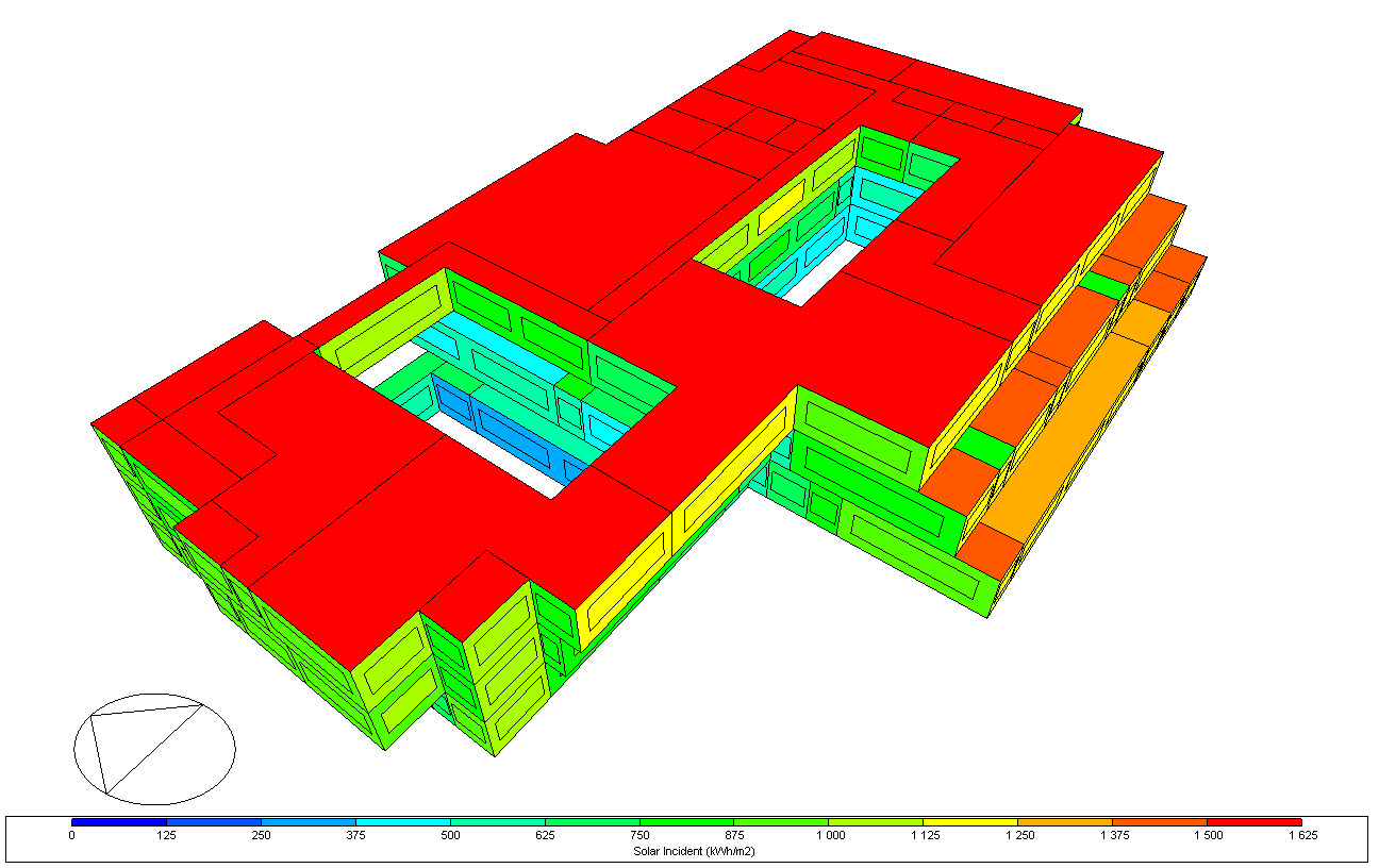
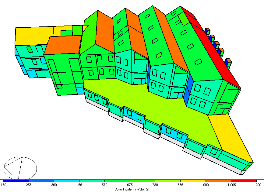
- Solar incident radiation over the year on each surface which can be useful to help with locating solar panels or to identify windows or roof surfaces in particular need of shading.
- Checking that internal gains for all zones over the year correspond with what is expected.
- Viewing total annual solar gains through all building windows to identify windows that may need upgraded shading.
The data visualisation tools are available from the Simulation screen on the Data visualisation tab. You can run a simulation from this tab by pressing the Update toolbar icon
 Make Settings
When running simulations from the Data Visualisation tab you will see a Make settings link in the info panel of the Simulation calculation options dialog.
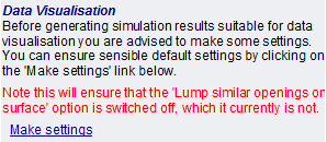
If the note is shown in red it means that DesignBuilder recommends checking that your output options are set up correctly for data visualisation. It is usually easiest simply to click on the Make settings info panel link to automatically make the recommended settings, in which case you will asked to confirm the changes to the model with the message below:
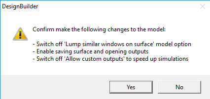
Confirm by selecting the Yes button, or No to cancel the changes.
Sample Outputs
Some examples of data visualisation outputs that can be generated are shown below.
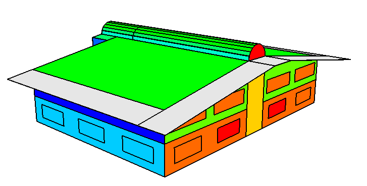
Annual Solar Incident Radiation Totals
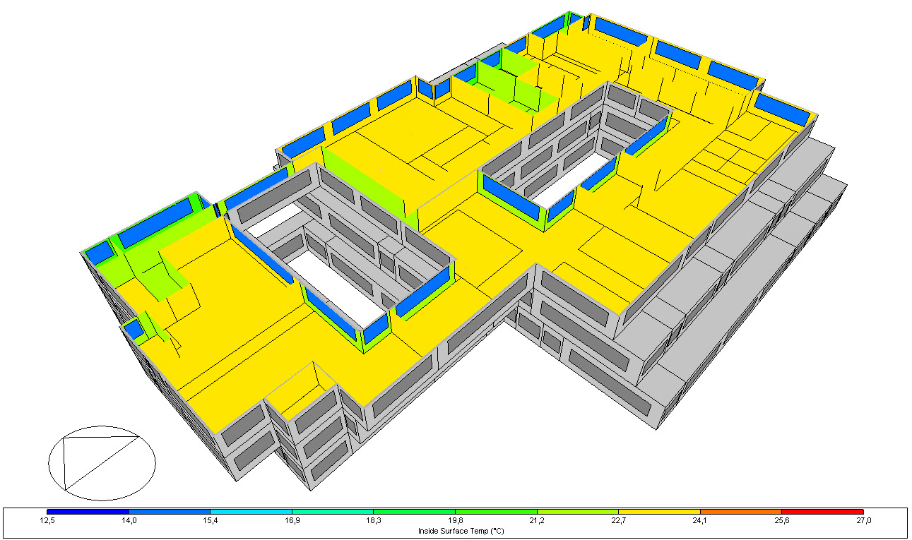
Annual Average Inside Surface Temperatures
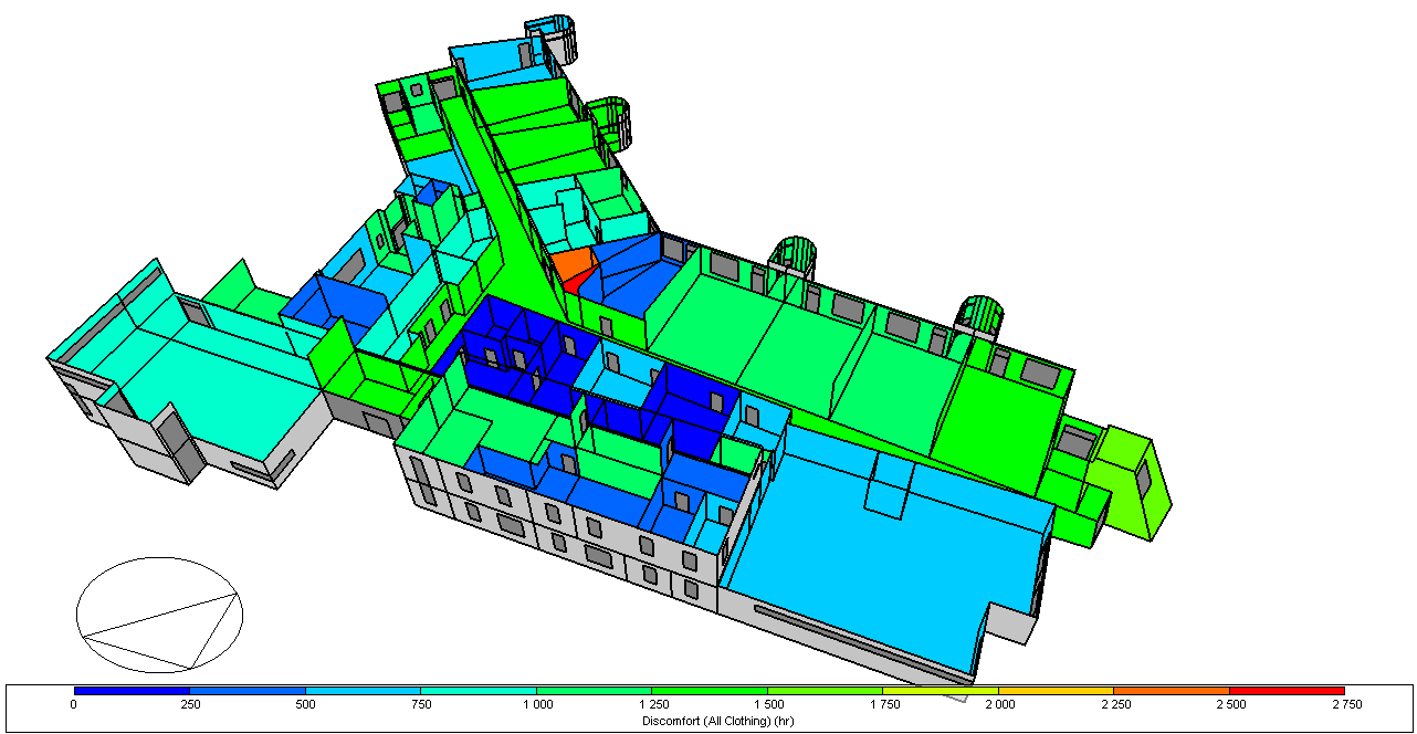
Annual Discomfort Hours for each Zone
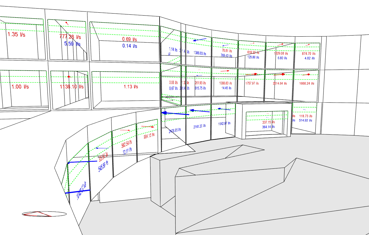
Airflow Vectors
Plot type
The plot types available are:
- 1-External surfaces where selected data is plotted on each external surface, e.g. Solar incident radiation.
- 2-Internal surfaces where selected data for internal surfaces is plotted on each surface, e.g. internal surface temperatures.
- 3-Zone data which allows calculated summary zone data to be plotted, e.g. total occupancy gains for each zone.
- 4-Airflow data to view airflow vectors at windows, vents, doors and holes when using Calculated natural ventilation. This option allows airflow vectors to be viewed for hourly and sub-hourly intervals only.
The Plot type selected affects the data that can be selected for display in the Output type option below.
Output type
Depending on which Plot type is selected (above) you can select the output type to be viewed from the options listed below.
Output list
Zone data
- Glazing gain
- Walls gain
- Ceilings gain
- Floors gain
- Solid floors gain
- Partitions gain
- Roofs gain
- Rooflights gain
- Ext floors gain
- Sens cooling energy
- Ext airflow gain
- Ext infiltration gain
- Ext nat vent gain
- Ext mech vent gain
- AHU heating energy
- Cooling energy
- Fans
- Pumps
- Preheat energy
- Reheat energy
- Radiant heater energy
- DHW
- Lights energy
- Process energy
- Catering energy
- Display lighting gains
- General lighting gains
- Miscellaneous gains
- Process gains
- Catering gains
- Computer + Equipment gains
- Occupancy gains
- Solar gains internal windows
- Solar gains external windows
- Plant heating
- Plant cooling
- Air Temp
- Radiant Temp
- Comfort Temp
- Occupancy Latent Gain
- Discomfort ASHREA 55 (sum clo)
- Discomfort ASHRAE 55 (win clo)
- Discomfort ASHRAE 55 (all clo)
External surface data
- Outside Surface Temperature
- Solar Incident
- Ext Sunlit %
- External Convective Heat Transfer Coefficient
Internal surface data
- Surface gain
- Inside Surface Temperature
- Internal Convective Heat Transfer Coefficient
- Solar Transmitted
- Airflow in
- Airflow out
Airflow data
Interval
Select the interval of the data that you would like to view from the list:
- 1-Annual to view annual data.
- 2-Monthly to view monthly total and average data. In this case you must also select the month.
- 3-Daily to view daily total and average data. In this case you must also select the month and day of the month.
- 4-Hourly to view hourly total and average data. In this case you must also select the month, day of the month and hour.
- 5-Sub-hourly sub-hourly total and average data. In this case you must also select the month, day of the month and time.
For example to view annual solar incident radiation set the Plot type to 1-External surfaces, the Output type to Solar incident and the interval to 1-Annual.
Normalise by area
Check this checkbox if you would like results to be displayed normalised by area, i.e. divided by the area of the surface or opening.
Show component blocks and assemblies
To see component blocks and assemblies on the data visualisation check this checkbox.
Option switched off
Option switched on
Legend
DesignBuilder provides you with control over how the legend is generated and displayed.
Range method
Select from the options:
- 1-Default where the most appropriate lower and upper values are calculated in such a way that the legend includes a manageable set of value intervals using "round" numbers avoiding unnecessary decimal places etc.
- 2-Min/max where the actual calculated minimum and maximum values plotted are used as the minimum and maximum range without any rounding applied. This can be useful to find the maximum and minimum values.
The range method cannot be changed while the Override range option below is selected.
Override range
Use this option to override the default calculated range. DesignBuilder calculates an appropriate range for the scale based on the data, but sometimes it can be useful to override that. For example if one zone has very high occupancy gains compared with all the others, it may be best to reduce the upper range Max value (below) to allow the variation across the other zones to be seen, avoiding the distortion of effect of the "outlier" zone on the overall scale.
Min value
When selecting the 2-Min/max Range method, the actual minimum and maximum values are used to define the scale. Checking the Override range option allows you to see the calculated min and max values. This can be useful data in itself, but you can also adjust the minimum value as required by typing in the required lowest value to be used in the scale here.
Max value
See above under Min value.
Min band colour
Select the colour to be used for the minimum band. Choose from:
- 1-Blue,
- 2-Cyan,
- 3-Green,
- 4-Yellow
By default the colours will range from blue (min value band) to red (max value band), through green, yellow and orange.
Note: the colour for the Min band selection must have a lower number than for the Max band selection (below).
Max band colour
Select the colour to be used for the minimum band. Choose from:
- 2-Cyan,
- 3-Green,
- 4-Yellow,
- 5-Red
Airflow Visualisation Controls
Vector scale factor
You can use the vector scale factor to adjust the size of all of the airflow vectors. Enter a higher number to see larger vectors and vice-versa.
Show opening airflow labels
If you would like to see the airflow rate printed on the rendered view then check this checkbox.
Label size
When Show opening airflow labels is checked you can select the size of the labels from the list:
Show North arrow
Check this checkbox if you would like the North arrow to be printed on the rendered view.
Note: The direction of the wind is printed in red at the same point regardless of whether the North arrow is displayed.
Using the Data Visualisation Tools
As well as all the usual view control tools (orbit, zoom etc), some extra tools are provided to help you get the most out of the data visualisation data plots and these are described below.
Note: You will need to use either or both of the Surface removal or Section cut tools to access data when the Plot type is 2-Internal surfaces or 3-Zone data.
Surface removal
Specific to the Data Visualisation function is the option to remove surfaces to allow internal surface data to be viewed. This option is available when the Plot type is 2-Internal surfaces or 3-Zone data. To use the surface removal tool, simply click with the mouse on any external or internal surface that you would like to be removed. You can use this tool to selectively expose data deep within a building without losing other data that you might also wish to view.
To restore a surface that was removed hold the <Ctrl> key down and click with the mouse again on the space where the removed surface should be.
To restore all removed surfaces press the <Esc> key.
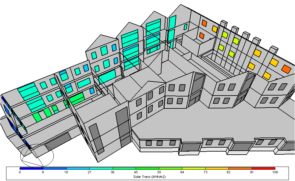
The example screenshot below shows how the distribution of building window solar gains can be viewed by removing surfaces.
Note: Removing surfaces in this way only affects the data visualisation view and does not affect the model itself.
Section cut
The Section cut tool can be used to cut a slice through the model to allow internal data to be viewed when the Plot type is 2-Internal surfaces or 3-Zone data. This tool can be especially useful for viewing data across a whole floor, or across a whole facade.
Movie generation
When the Interval is 2-Monthly or 4-Hourly you can generate a movie showing how the selected data changes with time.
Numeric outputs
To obtain a direct numeric output for a particular zone, surface or opening hold the <Shift> key down and click with the mouse on the surface of interest. The data for the current surface will be displayed in a tooltip until you release the mouse button.
Sub-Dividing Surfaces
Sometimes it is useful to be able to sub-divide surfaces. This can useful for 2 reasons:
- In DesignBuilder complex and non-convex surfaces are sub-divided automatically behind the scenes into smaller polygons to meet EnergyPlus requirements, in which case multiple EnergyPlus polygons will be used to represent a single DesignBuilder surface. When reading simulation results, DesignBuilder uses the value for the last polygon it reads in to represent the data for the whole surface rather than calculating an average for all polygons. If you see surprising results for large complex surfaces, this is probably the cause and, if you need a more accurate representation, you may prefer to manually sub-divide the surface in question using sub-surfaces as described below.
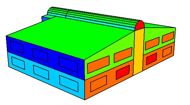
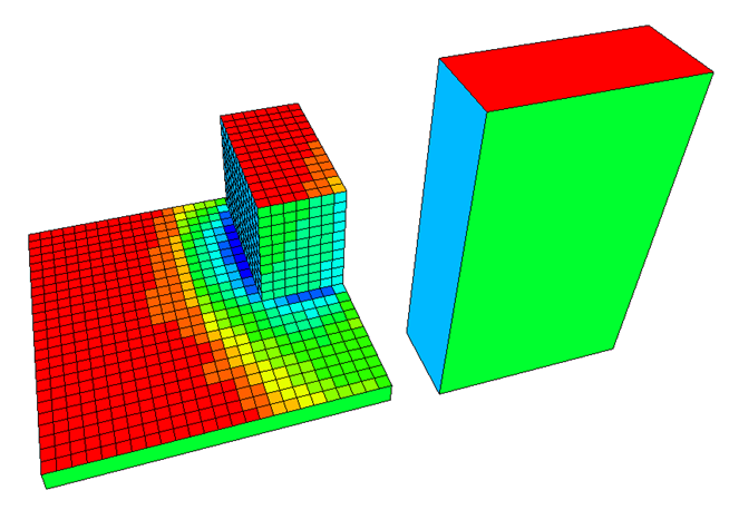
- You may need to view the distribution of conditions across larger surfaces for example to see how the solar incident radiation varies over a large flat roof to help decide on positioning PV panels. You can do this by placing a grid of sub-surfaces on any surfaces that need to be broken down and running the simulation as normal, making sure that surface data is stored for openings. In this case you can generate outputs such as that shown for a simple example below.
Tip: You can use the building level clone tool to copy a previously drawn grid of sub-surfaces to all surfaces in the model as required.
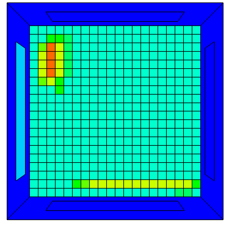
You can also report the distribution of conditions on internal surfaces. For example the screenshot below shows the distribution of temperatures on the surface of a floor of an example model.
Note: The technique of using sub-surfaces to display the distribution of conditions across larger surfaces does not work for adiabatic surfaces.